In The Press: Healthy Materials Lab

We are proud to announce that Lindsey Dieter’s essay We Are What We Specify – first published in the launch edition of container – has been featured at Healthy Materials Lab (HML). HML’s mission is to develop, promote, and implement toxin-free building materials whilst simultaneously increasing the transparency of material composition for consumers and professionals alike.

HML is a partnership between Parsons Design Lab, Building Product Ecosystems, Green Science Policy Institute, Healthy Building Network, and Healthy Product Declaration Collaborative.

Read the full essay below:


The number of times you and your fellow American citizens have confidently declared these words at the dawn of a new year are innumerable:

“This year, I will prioritize my health.”

“This year I will eat nutritious foods that are good for my body.”

In reality it is irrelevant whether or not people follow through with their intentions. Why, you might ask? The firmly rooted priority within our resolutions is human health, most often sought through exercise and improved nutrition. Our resolutions do not take into consideration a larger issue — material safety and quality in our built environment. Why not declare that we will furnish our homes with flame-retardant free furniture? Or that we will choose VOC-free paint, eliminate vinyl flooring, wall and window coverings from our homes and acknowledge that a manufacturer’s unbeatable prices for their furniture are saturated with formaldehyde?

Chances are that, regardless of education or socio-economic status, the individual declaring a movement towards better health has no idea that the built environment is affecting their health at an equal if not greater rate than the foods they consume. We spend an average of three hours per day consuming food. Our organs digest and absorb the nutrients (or lack thereof) embedded within each meal. We spend twenty four hours per day in or near a constructed environment and our skin — the most porous organ in the human body — is actively absorbing the chemical composition of every material we encounter. Unfortunately, the rates with which we experience the effects of vinyl flooring or high-gloss paint amplify gradually over long periods of time, whereas a rapidly increasing waistline is tough to ignore. There are a variety of efforts that can be taken in the fight against toxic environments. The manufacturer, consumer and designer all have the power to shift society’s attitude towards holistic health. I will examine this challenge from the role of an interior designer, presenting a cross-examination of the challenges inherent in selecting both nutritious foods and safe furnishings. After all, we are both what we eat and what we specify.

In an attempt to simplify an inherently complicated subject, I will examine the lifecycle of two common items: an apple and household paint. We are likely to come in contact with both of these items on a regular basis and upon first glance, neither suggest a threat to the human body. Although the lifecycle of each varies considerably, there are commonalities in the production and purchasing process of both. The common folk phrase “an apple a day keeps the doctor away,” is widely disseminated, and largely believed to be true. A quick web search on “how to freshen up a room” will reveal a similarly innumerable and trusted list of paint colors and topical applications with which to do so. Taken at face value, both assumptions are incredibly misleading.

PRODUCTION
The apple harvesting season in New York State runs a brief sixty days (roughly through September and October)1. How is it, then, that we can enjoy this health enhancing fruit whenever our hearts desire, three-hundred and sixty-five days a year? The answer lies in Controlled Atmospheric Storage. Apples are stored in sealed rooms where oxygen is reduced by an infusion of nitrogen gas, from approximately 21% (the level in the air we breathe) down to 1-2%. Temperatures are kept at a constant 32-36ºF. Humidity is maintained at 95% and CO2 levels are carefully controlled.2 Sounds harmless, right? As an independent process, yes. However, the mixture of nitrogen with The US’s most commonly used pesticide is concerning.

The US Department of Agriculture (USDA) found that 80% of the apples sold in the United States are coated with diphenylamine, or DPA.3 DPA keeps your prized honeycrisp its picture-perfect pink after months of cold storage. Sorry, you didn’t think that was a miracle of Mother Nature, did you? DPA was banned by the European Union in 2012 which should be more than enough impetus for the USDA to reevaluate the 0.42 parts per million (ppm) — 0.32ppm higher than the allowable concentration — present in the 10 pounds of apples consumed yearly by the average health conscious citizen.

The hazmat suit at the dinner table is starting to sound like a pretty good idea.

Paint production will inherently involve a more extensive list of ten-syllable words than a honeycrisp apple. However, not all of them are toxic (just most of them). Paint is composed of colored pigment, resin, a solvent and additives. Naturally-occurring pigments are readily available in minerals, insects and botanics that can be harvested to color textiles and paint. Reducing a negative health impact is possible through the use of a limited color selection using natural pigments. To achieve a palette of 16 million color varieties, Pantone employs a complicated and potentially toxic chemical recipe. For example, the “King’s Yellow 39” feature wall you are dreaming of contains high levels of arsenic, and the “Cinnabar Red” master bedroom will introduce mercury into your after-hours routine.4 Producing a standard batch of paint involves an industrial blending process combining water, titanium dioxide (TiO2), resin and calcium carbonate (CaCO3).5 TiO2 is an occupational carcinogen that may cause cancer with prolonged exposure. Paint manufacturers adhere to strict health and safety protocols involving industrial fans for proper ventilation and respiratory masks to ensure none of the toxic chemicals present are inhaled during production. The average consumer’s ventilation protocol is likely much less thorough. Reassuring your client that a coat of paint will freshen up any room seems to lose its validity when the resultant disclaimer includes sporting a hazmat suit prior to enjoying the addition of Pantone 7523 C to the dining room — food for thought…

dieter_img_1a

Figure 1. Pharos results for ECOS Interior Atmosphere Purifying Paint

PURCHASE
Purchasing power is fueled by the informed consumer. An overwhelming array of products are available for the choosing and it is the responsibility of the consumer to use the tools available to them to make an informed decision. This is easier said than done. In the case of an apple, the option to purchase standard or organic produce is likely top of mind. The standard produce is cheaper, but the addition of pesticides is guaranteed. Organic produce may cost more, but in order to be certified as USDA Organic, farmers must produce a history of substances used in the last three years, pay numerous certification fees, pass crop and produce inspections and reapply for certification annually.6 Although soil leeching, acid rain and crop cross-contamination can dampen the accuracy of the USDA Organic label, the use of a single third-party certified governing body provides the consumer a high level of confidence.

Unfortunately, the same standard of information does not exist among the plethora of paint colors available at Home Depot. Food products are required to display both an ingredients list and nutritional information chart. Manufacturers of building materials are not required to disclose any of the ingredients in their products. The building material equivalent to a food products ingredient list is a Material Safety Data Sheet (MSDS). The MSDS must be made available upon request; however, the level of accuracy with which these sheets are filled renders the information nearly useless. A manufacturer can wash their hands of any obligation to provide complete product disclosure with a simple “proprietary information” statement. When you are fortunate enough to find a MSDS online, the majority of chemical ingredients are listed as complying with an outdated standard followed by an indecipherable numerical indicator. In an ideal world, the name and packing of a product would be informative enough for you to make an educated decision that is in line with your priorities. For example, ECOS Interior Atmosphere Purifying Paint sounds too good to be true. You mean I can freshen up the aesthetics and air in my living room simultaneously? Hardly. To aid in unlocking the proprietary secrets of our built environment, the highly trained team at Pharos has created an extensive database of both building products and chemicals. A single search can reveal a detailed contents list, hazard summary, lifecycle research and additional documents directly sourced from the manufacturer. Our too-good-to-be-true ECOS Interior Atmosphere Purifying Paint proved to do quite the opposite (Figure 1). The paint is composed with 20% TiO2 and 25.1% Oleic Acid, a compound on the German FEA Restricted Hazards List. The remaining ingredients are associated with gene mutation, developmental toxins, respiratory, eye and skin irritation, and persistent bio-accumulative toxins that will not break down once released back into the environment. The hazmat suit at the dinner table is starting to sound like a pretty good idea.

MOVING FORWARD
So with all of this information, where does the future of not only our good intentions but the health and wellbeing of society at large stand? First and foremost, there is no gain in sugar-coating the seriousness and complexity of this issue. We are facing an epidemic of rapidly decreasing societal health that cannot be taken lightly. Fortunately, the USDA is working in our favor when selecting the foods we put in our body. Who is on our side when determining the fate of the occupants within buildings? There is potential for change at every step of the design process. Manufacturer transparency will establish trust and drive highly toxic products out of production. Designers can implement a zero-tolerance policy for the use of chemical-laden materials into designs. Contractors can verify that all products entering a job site are supporting the health of future occupants. We have the creative capability to innovate in both the specification and design of material systems that are not harmful to the human beings at the core of our work. If the design is lethal, aesthetics are irrelevant. Unless designers everywhere are interested in introducing an occupant waiver form into their design brief, it is of the utmost importance that we do the research, specify accordingly and educate.

TIPS

  • Look to reputable designers who are creating incredible spaces that are not harmful to the environment. You don’t need to re-invent the wheel; you just need to refine the options available when you spin.
    Select no VOC paints in a color palette derived closely from what nature does well already. This doesn’t translate into a granola infused interior, but the vibrant neon-blue is likely out.
    Innovate in material applications. Introduce plaster onto vertical surfaces, experiment with textiles for acoustic barriers and engage in the versatility of simple materials.
    Use solid wood furniture and water-based paints and stains.
    Look to trusted third-party certifiers like Green Guard, Pharos, The Forest Stewardship Council and LEED. Mandate that manufactures provide you with both MSDS and Healthy Product Declaration Act (HPD) information. If the manufacturer doesn’t know what an MSDS or HPD is, educate accordingly.
    Avoid products with brominated flame retardants, phthalates, harsh sealants and polyvinylchloride.

Finally, sleep soundly knowing your careful consideration in specifying materials and finishings is not only shifting the market towards the production of healthy building materials but is protecting the health and wellbeing of everyone.

LINDSEY DIETER

NOTES

1 : NEW YORK HARVEST, accessed January 2015, http://www.pickyourown.org/NYharvestcalendar.htm.
2 : Rackley, 35 – 40.
3 : APPLE CHEMICAL COMPOSITION, accessed January 2014, http://rt.com/usa/154676-us-appkes-chemical-ban/.
4 : Smulders, et al., 47
5 : PHAROS Project. http://www.pharosproject.net.
6 : USDA, accessed January 2015, http://www.usda.gov/wps/portal/usda/welcome.

BIBLIOGRAPHY

Smulders, S., K. Luyts, G. Brabants, L. Golanski, J. Martens, J. Vanoirbeek, PH Hoet, “Toxicity of nanoparticles embedded in paints compared to pristine nanoparticles, in vitro study.” Elsevier Ireland Ltd 2014.
Richard Jones, “Soft Machines.” Oxford University Press, 2004.
Rackley, Stephen A., Carbon Capture and Storage. Boston : Butterworth-Heinemann/Elsevier, 2010.

PLATES

Figure 1: ECOS Interior Atmosphere Purifying Paint, https://www.pharosproject.net/

 

Elevation into the Sacred

“The more simply and essentially the shoe-equipment is absorbed in its essence […] the more immediately and engagingly do all things become, along with them, more in being. In this way, self concealing becomes illuminated. Light of this kind sets its shining into the work. The shining that is set into the work is beautiful.” 1

B

oth footwear and architectural foundations share signification as functional, survivalist structures simultaneously interpreted as humanist and divine. This juxtaposition inspired unique forms of each — namely, the elevated foundation of Ancient Greek temples and the high-heeled shoe — that lift the terrestrial into a divine realm. While architecture emanated from a necessity for sanctuary, and footwear from a requirement for increased mobility, their rudimentary functions can be understood as extensions of our bodies’ capabilities: the shoe hardens the sole and the buildings expand the structure of the body. In The Temple In the House, Anthony Lawlor expresses this resemblance as the essence of architecture:

“A building’s structural system is […] engineered to balance contractive and expansive forces. This condition is reflected in our skeletal and muscular system. The bones of the feet spread out to create a platform that upholds the rest of the body. The legs act as two pillars, extending away from the earth’s gravitational pull. The pelvis serves as a crossbeam, which in turn supports the spinal column. The shoulder blades act as another beam, supporting the neck and head. The dome-like structure of the skull recalls the span of the roof.” 2

This analogy represents the mutual origin of shoes and dwellings as life-support systems extending “the stream of inner intelligence that flows through the body into structural elements.” 3
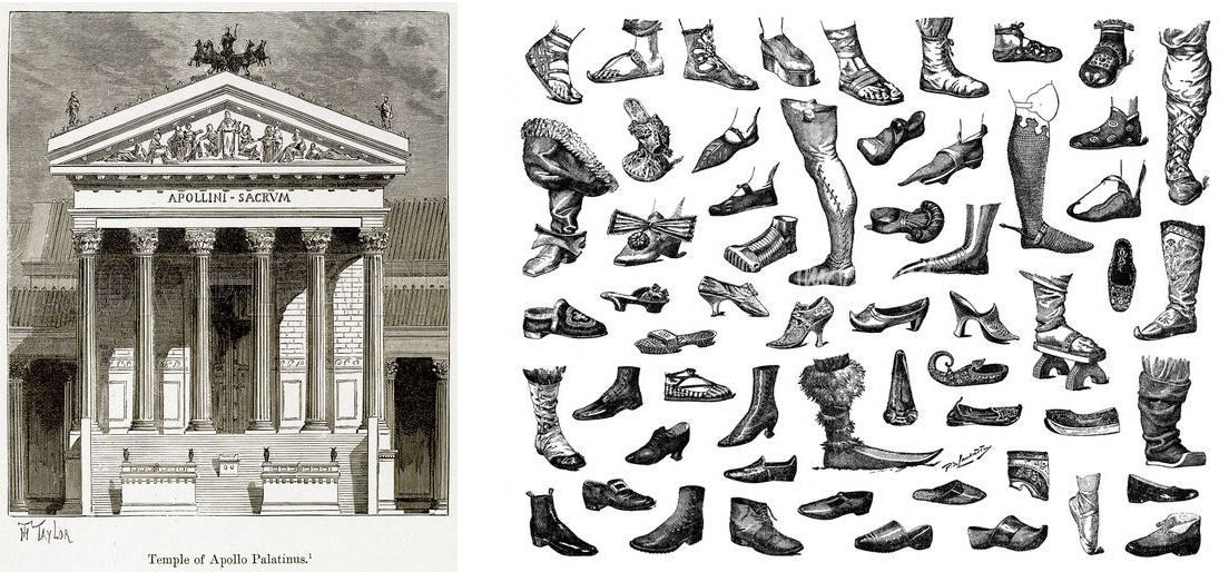
In later centuries, both footwear and architecture garnered iconographic representations of the sacred. In antiquity, the “new” Greek temple first appeared as an actively geometric container with a high, upward-thrusting gable.4 Its base acted as the critical sacred lever allowing the temple to rise out of the ground and, as if inevitably, lifting the columns and surrounding structure out of the profane and into the sacred. Scully writes, “The whole rises, and the word here must be rises, out of the ground, rises upon a stepped base, which is itself swelling upward also, so that one force is acting through the whole”.5 The effect can be dramatic; the temple of Apollo is elevated so elaborately from the earth that the remaining void seems to drop off from the columns, and suddenly the mountains and earth come in close proximity to the viewer. 6
This effect is not limited to upward movement. Greek amphitheaters descended into the earth, offering a more secular communal effect. “Where the temple on the hill rose to a unique point of singularity, the amphitheater drew diverse people together in an experience of communal unity.” The base, through the act of raising or lowering a sacred whole, fundamentally signifies the ascent and descent of the spirit. 7

appollo temple

Historical texts serve as support for the symbolic function of footwear, with the heel in particular acting as a stand-alone sacred lever. In ancient Greece and parts of Africa, sumptuary laws forbade lower class citizens from wearing ornamental footwear, or even from wearing footwear at all. 8 The elevated heel was limited to members of the upper class, who were thought to have adorned this style to make apparent their wealth and status as divine beings.9 Within the Ottoman Empire, platform stilts known as kabkabs were worn by upper-class women. In Japan, the geta — a sandal resting upon stilts — was worn solely by emperors and priests. 10 The introduction of the heel into Western culture in the 13th-century is also attributed to a sacred elite; the horseback riding Persians and Mongols of Central and Eastern Asia likely introduced these forms to the French during the Crusades. 11

In The Origin of the Work of Art, Heidegger defines the elusive sacredness of objects as an object’s “thingliness”. 12 This essence, Heidegger argues, is greater than the “equipmentality” of the object and its given form, greater than the collection of an object’s properties, and greater still than the sum of our many perceptions of the object in question. It is instead best understood as a self-sufficient quality that precedes the object, and from which the aforementioned properties are birthed. 13 What renders objects as sacred symbols is the exposure of a truth inherent to the object itself.
The presumption of preexistent sacred form is apparent in our understanding of Ancient Greek temples. Influenced by monumental dipylon jars of the same period, these temples were initially constructed with the purpose of containing a deity already present at the site in which these temples were built. Says Vincent Scully in The Earth, the Temple, and The Gods:

“[…] we must […] recognize that, not only were certain landscapes indeed regarded by the Greeks as holy and as expressive of specific gods, or rather as embodiments of their presence, but also that the temples and subsidiary buildings of their sanctuaries were so formed in themselves and so placed in relation to the landscape and to each other as to enhance, develop, complement, and sometimes even to contradict, the basic meaning that was felt in the land.” 14

Historical accounts of footwear are indicative of the same conception. Ancient Assyrian reliefs consistently show feet as placed firmly on the ground, reconciling the mobility of man with a need to belong to and be continuous with the spiritual space of the Earth. 15 The display of shoes of Holocaust victims in the United States Holocaust Museum is an evocative contemporary example of the powerful symbolism of shoes as the representations of sacred bodies. Says Shari Benstock in Footnotes on Shoes, “we envision the shoes attached to bodies that we ourselves invent to complete the effect. As such, [they] accrue a moral power.” 16

Louis XIV of France

The ever-present tension inherent between human constructs and the essential godly force contained within is precisely what allows for the exposition of sacredness, or what Heidegger calls “truth in action.” Heidegger compares this revelation to the cyclical ascent and descent of water out of and back into the basin of a Roman fountain; the sacred and the humane are understood in relation to each other, each revealing and raising the other into self-assertion. Scully’s depiction of ancient Greek temples mirrors this understanding. According to Scully, the new temple for the first time begins to reveal and simultaneously reconcile oppositions between man and god, representing to all men, “the presence of a god and [being] itself the monument of that presence.” The temple is simultaneously representative of the earth and free from it, a “true personality and force.” 17 Heidegger describes this phenomenon in detail:

“Standing there, the building rests on rocky ground. This resting of the work draws out of the rock the darkness of its unstructured yet unforced support. Standing there, the building holds its place against the storm raging above it and so first makes the storm visible in its violence. The gleam and luster of the stone, though apparently there only by the grace of the sun, brings forth the light of day the breadth of the sky the darkness of the night. The temple’s firm towering makes visible the invisible space of the air. The steadfastness of the work stands out against the surge of the tide and, in it’s own repose, brings out the raging of the surf.” 18

It is important to note that the foundational element of the whole of the temple — the elevated base — serves no functional purpose whatsoever. In The Origins of Greek Architectural Orders, Barbara Barletta mistakenly interprets these bases as ornamental:

“In Doric architecture, the structural role played by bases will be assumed later by a continuous stylobate,” although separate bases still appear in the seventh century, as already noted in the temple at Ano Mazaraki. […] because the stylobate alone would have been sufficient to elevate and thus protect the wooden supports, this combination [in Doric architecture] must be understood as decorative.” 19

The base is instead an element that makes possible Heidegger’s “truth in action,” allowing the sacred to be represented by the temple; it is a free-standing agent of the sacred act.
This point can be comparatively understood through an analysis of high heels in footwear. Though existing in antiquity, it is only after the shoe begins to “unconceal” the sacred human body does the high heel began to emerge as an almost autonomous vestigial element of the shoe — a true independent form that continues to coexist with footwear today. 20 The impact of the high heel on sacred form was most clearly made apparent by Louis XIII and Louis XIV, both of whom wore high heels with the specific intention of elongating and creating gracefulness in their heavy bodies. 21 The result was considerable: standing in heels was shown to elongate the leg, raise the buttocks, curve the back, and push the chest forward. When worn by women, the effect is even more pronounced by effectively doubling a woman’s middle pelvic angle. Walking in heels further exaggerates the motion of hips, accentuates curves, and feminizes the gait by shortening the stride and causing a mincing step. 22

Like Barletta’s assessment of the elevated base, the high heel was labeled by some as ornamental, and not thought to endure. Adolf Loos dismisses the high heel as an arbitrarily ornamental relic of a more primitive feminine fashion. For Loos, the coquette, the prostitute, the demimondaine led the way in a woman’s dress 23, but their fashion would quickly lose influence as women gained greater equality to men. He writes:

“We are approaching a new and greater time. No longer by an appeal to sensuality, but rather by economic independence earned through work will the women bring about her equal status with man. The woman’s value or lack of value will no longer fall or rise with the fluctuation of sensuality. Then velvet and silk, flowers and ribbons, feathers and paints will fail to have their effect. They will disappear.” 24

So Help Me Hannah: Snatch-shots with Ray Guns

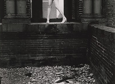
Loos, like Barletta, overlooks the powerful ability of the form to reveal the sacred body, an effect so profound that heels maintained in popularity well past the French Revolution — a time when many “elite” ornaments were discarded as symbolic of aristocracy — through the women’s rights movement of the 20th century and onward, despite the significant discomfort they inflict upon the body. 25
In “The Modern Foot,” Lyons understands this phenomenon in much the same way as Heidegger’s theory of “truth in action.”

“Instead of framing the shoe as in a functionalist narrative—a narrative about the shoe-as-protection, or the shoe-as-replacement/fetish, or the shoe-as-commodity, we ought to consider the shoe (the fabulous shoe, at least) as a thrilling response to the ambivalence of modernity, to its relentless shuffle between liberation and discipline. For if, as sociologists of modernity have argued, modernity itself is constituted by the tension between the liberating forces of modern autonomy and the restraining forces of modern disciplinary governance, then surely we must be able to identify cultural artifacts products by that conundrum. The fabulous shoe, I would argue, is one of them.” 26

Like the base of a temple, the heel acts to both reveal and reconcile oppositions between a disciplinary entity and an expression of liberation, reflecting the strife existent between an expansive world and the earth upon which the world is grounded.

LINA SHAHHAL


NOTES

1 Heidegger 32

2 Lawlor 109

3 Lawlor 103

4 Scully 43

5 Scully 63

6 Scully 177

7 Lawlor 81

8 DeMello 310

9 DeMello 158

10 DeMello 75

11 DeMello 158

12 Heidegger 4

13 Heidegger 10

14 Scully 3

15 Bondi 49

16 Benstock 9

17 Scully 44

18 Heidegger 41

19 Barletta 47

20 Bondi 168

21 DeMello 168

22 Benstock 10

23 McLeod 6

24 Loos 70

25 DeMello 159

26 Lyons 279


PLATES

2 Temple of Apollo, Palatinus. Illustration from “History of Rome” by Victor Duruy (Kegan Paul, Trench & Co, 1884).

3 Shoe Designs, Unknown Origin

4 Louis the XIV of France, Hyacinth Rigaud, 1701. Public Domain.

5 Hannah Wilke, So Help Me Hannah: Snatch-shots with Ray Guns, 1978. Gelatin silver print; Image: 33.1 x 21.8 cm (13 1/16 x 8 9/16 in.) Sheet: 35.4 x 28 cm (13 15/16 x 11 in.) The Metropolitan Museum of Art, New York, Purchase, The Buddy Taub Foundation Gift, Dennis A. Roach and Jill Roach, Directors, 2010 (2010.353) http://www.metmuseum.org/Collections/search-the-collections/294414.


BIBLIOGRAPHY

1. Barletta, B. (2001). The Origins of the Greek Architectural Orders. London: Cambridge
University Press.

2. Benstock, S & Ferris S. Footnotes on Shoes. London: Rutgers University Press.

3. Bondi, F & Mariacher, G. (1983). If The Shoe Fits. Italy: Cavallino.

4. Canon, J. Sacred Spaces: Decoding Churches, Cathedrals, Temples, Mosques and Other Places of Worship Around the World. (2013). London: Watkins Publishing

5. Corbusier, L. (1923). Vers Une Architecture. (1923). New York: Dover Publications.

6. DeMello, M. (2009). Feet and Footwear: A Cultural Encyclopedia. Oxford: Greenwood Press.

7. Heidegger, M. The Origin of the Work of Art. In Heidegger, M. Off the Beaten Track (pp.156)

8. Lawlor, A. (1994). The Temple in the House: Finding the Sacred in Everyday Architecture New York: G.P. Putnam’s Sons.

9. Loos, A. (2011). Adolf Loos: Why A Man Should Be Well-Dressed. Vienna: Metroverlag.

10. Lyon, J (2011).The Modern Foot. In Benstock, S & Ferris S (Eds.) Footnotes on Shoes. (272-281). London: Rutgers University Press

11. McLeod, M. Undressing Architecture. Fashion, Gender, and Modernity. In Fausch D., Architecture in Fashion (pp. 39-123). New York: Princeton Architectural Press.

12. Mumford, L. (1952) Art and Technics. Oxford: Oxford University Press.

13. Scully, V. (1962). The Earth, The Temple, and the Gods. New Haven and London: Yale University Press.

Hand in the Machine

T

he scope of architects’ responsibilities is drifting toward a state of ambiguity, while a coherent generational style remains undefined (branding, design-build? sustainability? parametrics?). Despite expanding boundaries, one component of contemporary design has become indisputable — the influence of the computer. Beginning with the development of early CAD technology in the 1960s, computer influence on architecture has advanced to a state of near-necessity. The forms, fabrication, and construction of the modern material world would indeed be inconceivable without software input. Within this machine dependence lies an inherent problem addressed by the sociologist Richard Sennett in his book The Craftsman. He writes, “The smart machine can separate human mental understanding from repetitive, instructive, hands-on learning. When this occurs, conceptual human powers suffer.” 1 However, as he presents his research throughout the book, Sennett articulates a theory defining the latent role craft plays in the digital age, and it is through this lens that I will consider the relationship between modern craftsmanship and computer technology.

Craft is defined primarily as an occupation or trade requiring manual dexterity or artistic
skill, but also describes an ability to plan, make, or execute. As we have moved from the analogue to a predominantly digital platform, it is relevant to consider these two explanations on their own merit. I would posit that the term “craft” has undergone a shift in identity, from an association with manual dexterity towards “planning” and “making.” For Sennett, creation by and finesse with the hands informs and improves the mind. He cites examples ranging from Linux programmers to masons, but it is the former that proves most compelling when considering craftsmanship in contemporary architecture. A carpenter honing his abilities through hours of practice demonstrates occupation-oriented craft, or a specialized skill-set centered on the hand-mind relationship. But skill, as Sennett explains, is the repetition of an action enabling self-criticism.2 The Linux technicians who donate their time to improve an open source network have refined an ability to command operations through repetition. Furthermore, they have resolved to improve upon a free system through group participation. Emphasis is placed on achieving quality, rather than profits, “the craftsman’s primordial mark of identity.” 3

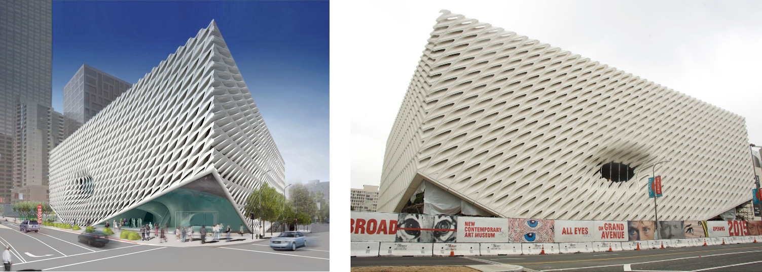
rendering of the Broad museum in LA and the built museum in LA by  Diller, Scofidio + Renfro

The Broad Museum, designed by Diller, Scofidio+Renfro, shown as a rendering and in its realized form. Has scripted generation, in this example, lived up to its expectations of an “innovative veil”?

Delving back through the history of architecture, consider the disparity in construction of two homes built during the 1920’s, the first in Prague, the second in Vienna. One was designed by Adolf Loos, the other by philosopher Ludwig Wittgenstein. Wittgenstein attempted to erect a “perfect building” based on the precedents of all former and all possible buildings.4 Loos, meanwhile, built the Villa Muller on his ethos of new objectivity, or maintaining honesty in a structure that shows clearly the intention and actual construction in its form.5 The result of Wittgenstein’s approach was a building that lacked “primordial life”, he self-critiqued; his attempt at perfection foiled by the mere undertaking of such a monumental task. Loos’ sense of honesty—in site, context, and program—produced a building more complete in its architecture and more sympathetic to its inhabitant.

This example provides an interesting segue into the digitally derived manifestations of contemporary architecture, specifically those employing scripts. Sennett rails against the common misuse of machinery when it deprives humans from learning through the repetitive process. It is a relevant critique with consideration to parametric programs like Grasshopper. Though the knowledge to wield this potent software is rigorous, the actual output can at times generate evocative but dishonest forms. Utilizing the technology as a means for developing details or patterns, for example, is valuable, but if used as a means for wholesale generation of conceptual or massing strategies it is irresponsible. It strips architects of the quality held most sacred to the profession: an intimate understanding of the product being constructed. Sennett writes,

“Modern computer programs can indeed learn from their experience in an expanding fashion. The problem…is that people may let the machines do this learning, the person serving as a passive witness to and consumer of expanding competence, not participating in it.” 6

Material knowledge has also been affected by advances in computer technology. There is at once a nuanced experimentation that provides opportunity for material development and application, this being a positive, albeit recent resultant. However, computers have the ability to separate the craftsman from the detail. The quality of design from Carlos Scarpa, for example, who relied on the knowledge of local tradesmen to develop a more complete architecture, is lost when the head and the hand diverge. The danger with digital dependence is the tendency toward a lack of material specificity while the rapid advance of CAD/BIM software, like Revit, may have pulled architectural representation ever farther from its resultant.

ICD/ITKE Research Pavilion

ICD/ITKE Research Pavilion


This is not to say, however, that the digital age has demolished the frameworks of the field of architecture. Quite the contrary. The above examples highlight the negative potentials of computerization, but when operated in capable hands, digital means provide a tool to aid not only in the conceptualization of complex form, but also in fabrication processes that enable realization. Therein lies the nature of craft itself: that of planning, making, and executing. On the effects of computational architecture, Alan Penn, Dean of the Barlett-UCL, writes,

“it brings the potential to put the designer once again in direct control of the craft of material shaping and construction, something unseen since the medieval craftsman masterbuilder gave way to the divisions of labour that characterize the modern industry.” 7

Material manipulation by use of digital instruments coupled with an intimate understanding of the tools with which to investigate operational possibilities is the embodiment of the modern architectural craftsman, and, arguably, the craftsman at large. Where at points throughout the last century craft was ostracized in favor of manufactured, off-the-shelf components (outliers notwithstanding), technology has allowed it to be reincorporated into contemporary architecture through an increased understanding of new machinery coupled with new software. This marriage provides the platform from which architects can relocate themselves within the design and construction industries, back at the heart of the process. 8

From projects exhibited at a peer-reviewed conference held at the Bartlett School of Architecture in 2011 titled FABRICATE, I have selected several projects that exemplify a dedication to craft in computational design, each emblematic of a point from my argument above. From academia to professional practice, these examples highlight the prowess of technology when deployed under the pretense of a craftsman’s approach.

The first comes from the Institute for Computational Design at Stuttgart University. As a temporary structure, Research Pavilion ICD/ITKE is “based on an understanding of form, material, and structure not as separate elements, but rather as complex interrelations embedded in and explored though integral processes of computational design.” 9 Exploiting an unforeseen moment discovered during the process of material testing, the designers exploited the limitations of their industrial robotic fabricator, and maximized the physical behavior and material characteristics of 6.5mm-thin birch plywood strips in the computational generation of form, in this case basing the entire structure on the elastic bending capacity of plywood, alternating compressive and tensioned moments along the length of the robotically manufactured individual strips.

William O'Brien for Aesop

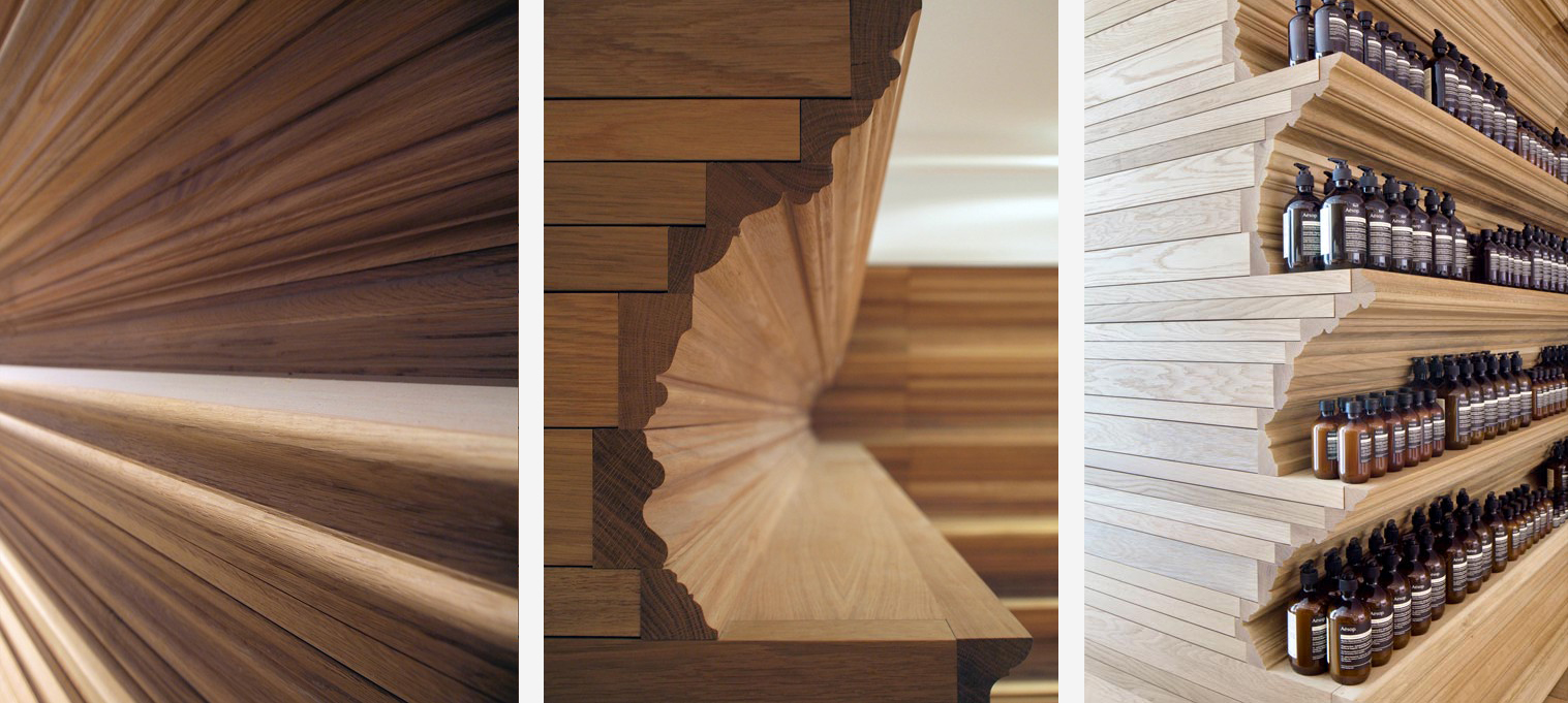
Details of routed moulding design at Aesop Newbury Street


There is a celebration in this project both of the command over tools with which to create structure, and the conceptualization of material deformation. Craftsmanship, in this case, lies in avoiding perfection during the design phase, where, as Sennett writes in his description of the Villa Muller, the designer allows the tool to display its intention.10 The ICD’s computational fluency allowed the tools to dictate output, but their comprehension (albeit, partially through computer 3-D scanning technology) and exploitation of their material discovery distanced them from the CAD-reliant examples Sennett cites in his book.

The second example derives from a conversation held between the architect Mathias Kohler and the structural engineer Hanif Kara, wherein the singularity – or combining of design disciplines into a single entity – was considered. Put more simply, can the magnitude and breadth of computer technology skip certain trades entirely, to the point of extinction? Mouldings, for instance, that once required hand skill but can now be accomplished through CADCAM routing. According to Kohler, digital fabrication has provided designers with the means to personally interface with the manufacturing of their architecture. Prior to this relationship, construction existed on a 2-D, conceptual level, where the drawn detail is merely a suggestion that must be interpreted by a subcontractor, reproduced through shop drawings, and executed by a builder. With digital fabrication, the drill bit and a sheet material become the means to provide a finalized product. “This explicit connection between design and making leads to the renegotiation of the different roles of the participants, both in the design and planning process of architecture, as well as the building and construction process,” explains Kohler.11 Pressed on whether the rapid advance of architects’ “explicit knowledge” indeed signals the demise of the consultant, he momentarily backpedals.
“I don’t believe that the architect should be overruling the experts, the contractors or the craftsmen working with the material on a day-to-day basis. I believe in new modes of collaboration.” 12 He asserts that increasing amounts of information will originate from the architect, and that this information will be transcribed directly to a machine that will in turn produce design.

Based in the essential logic presented in the aforementioned projects, MIT professor Skylar Tibbits is proposing a wholly new form of next generational thinking. Logic Matter, as he calls it, is a paradigm shift in the assembly process of our built environment, where the individual material parts required to construct a complex structure are embedded with blueprints to self-guide the successful construction of said form. Conceived with the knowledge that the translation of design from hand to screen to fabricator to material to machine is imbued with flaws, Tibbits is interested in a self-assemblage that resembles the natural processes of our bodies. He describes Logic Matter as a compositional series of

“physical building blocks that demonstrate digital logic and computation by passively connecting brick-to-brick (i.e. no electronics, only geometry performs the computation). These building blocks can encode assembly information and guide the user in successfully and quickly building any complex structure.” 13

Logic Matter’s ambition extend beyond mere craft. It defines innovation. It strives to think beyond what is available to the architect in current practice and invents a means to revolutionize the industry.

To conclude, it can be logically deduced that the architect will be forced to initiate the type of technological departure Tibbits has conceived in order to realize the scope of their conceptual work. Though this has been the case in previous generations, contemporary demand for revolutionary technology is far outpacing the industry. This evolution must advance in unison with a material catalogue.

Craft, therefore, must remain in the collective architectural conscious. To be computationally innovative requires knowledge of and willingness to adapt to the stresses and language that each medium dictates. As Sennett wrote in The Craftsman, “computer-assisted design might serve as an emblem of a large challenge faced by modern society: how to think like craftsmen in making good use of technology.” 14 A challenge? Yes, but more so an opportunity to facilitate the composure of a new architecture.

ALEX STEWART


NOTES

1 : Sennett, p. 29
2 : Sennett, p. 37
3 : Sennett, p.25
4 : Sennett, p. 255
5 : Sennett, p. 255
6 : Sennett, p. 41
7 : Glynn, p. 15
8 : Glynn, p. 21
9 : Glynn, p. 22
10 : Glynn, p. 24
11 : Glynn, p.117
12 : Glynn, p. 117
13 : Glynn, p. 51


BIBLIOGRAPHY

Glynn, Ruairi and Sheil, Bob. Fabricate: Making Digital Architecture. Autodesk, Riverside Press. 2011.

Sennett, Richard. The Craftsman. Yale University Press. New Haven and London. 2008.


PLATES

Fig. 1: Photograph by Gary Leonard. Diller, Scofidio + Renfro, The Broad Museum. From: http://archinect.com/news/gallery/117439302/0/is-the-broad-museum-s-newly-unveiled-facade-living-up-to-its-renderings (accessed February 23, 2015).

Fig. 2: Diller, Scofidio + Renfro, The Broad Museum. From: http://www.thebroad.org/building/renderings (accessed February 23, 2015).

Fig. 3, 4, & 5: Institute for Computational Design, Institute of Building Structures and Structural Design, ICD/ITKE Pavilion. From: http://www.oliverdavidkrieg.com/?page_id=123
(accessed February 23, 2015).

Fig. 6 & 7: William O’Brian, Jr. Routed mouldings for Aesop Newbury Street. From: http://aarome.org/news/features/william-o-brien-jr-pursues-a-refreshed-criticality-toward-contemporary-architectural-form (accessed February 23, 2015).

Fig. 8: William O’Brian, Jr. Routed mouldings for Aesop Newbury Street. From: http://www.dezeen.com/2012/11/12/aesop-boston-by-william-obrien-jr/ (accessed February 23, 2015).

Fig. 9: Logic Matter, Self-Assembly Lab. From: http://www.selfassemblylab.net/img/MIT_LOGICMATTER/Programming_the_Units_2_cropped_small.jpg (accessed February 23, 2015).

Design, Rehearsed

W

hat if the process of designing for architecture was more akin to the process of staging a play?  Though the end products of architectural design and theatrical design are quite different, each design process has much in common.  In both cases, concept development, integration of design teams, collaborative meetings and iterations of design proposals all follow a similar timeline for accomplishing the final production goals.  Staging a play, however, takes advantage of an ongoing rehearsal process where design concepts can be prototyped in the early stages of development and tested throughout the production and in every performance.  Here, both the aesthetic and experiential properties of a production are devised and rehearsed through an inclusive collaboration between designers, performers, and audience members.  Through diligent iteration, both performer and production begin to acclimate, adapt and respond to one another so that the audience can invest in a cohesive and consuming experience.

On the other hand, architecture can be quite difficult to rehearse.  Architects and designers can study existing buildings and circulation spaces to observe how people move and interact, but scale models and renderings are often the only realistic tools available to communicate a design’s intentions to the people who will eventually inhabit it.  Without a shared understanding of purpose and functionality, the dispersion between a design’s intention and its eventual use can be quite extreme.  A 2008 study by the New Buildings Institute1 reveals great discrepancies between the projected and actual energy consumption of new LEED-certified buildings.  In response to these findings, they recommend better feedback systems that will enable the design community to fully appreciate how their systems actually end up performing.  It is only reasonable to assume that a more inclusive process will not only improve a design’s functionality, but also the experience one has within it.  In response to this growing awareness, we can look to a participatory design process that can engage with the eventual audience of end-users and provide a platform for collaborative feedback.  We must rehearse the design.

Design Trust for Public Space

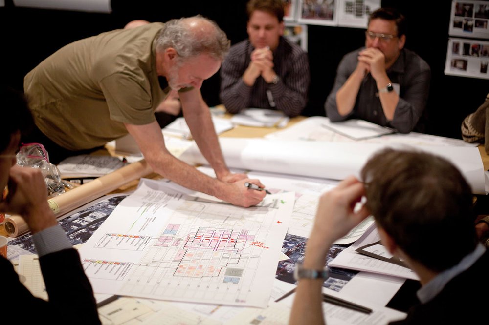
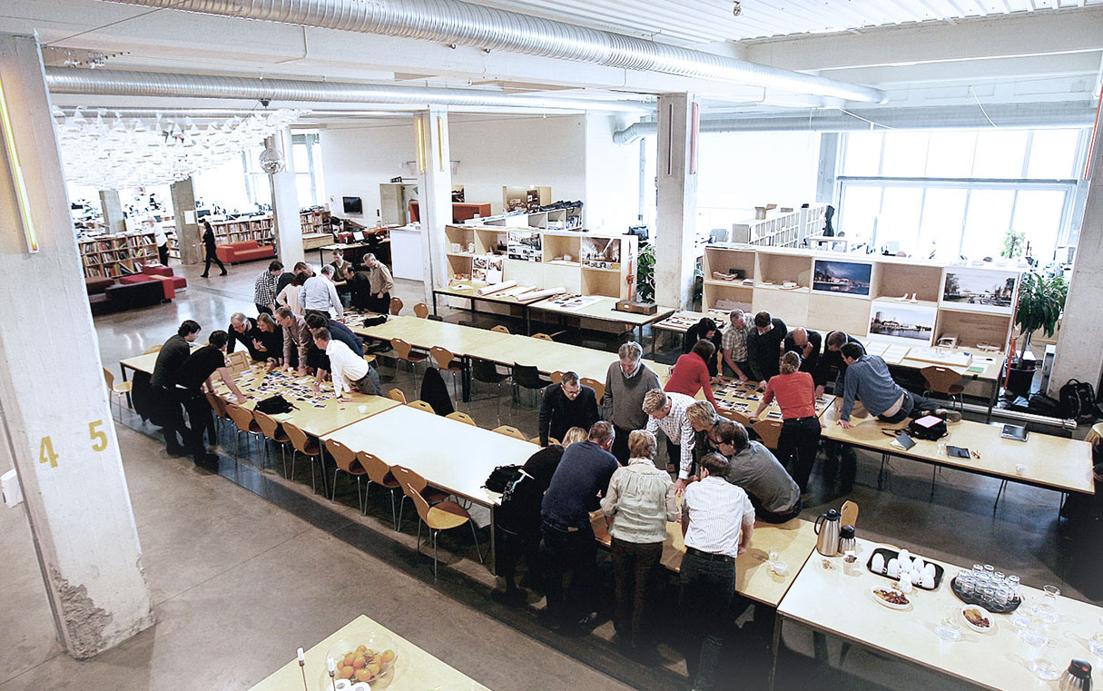
Architects, designers, and stakeholders collaborate on a new vision for New York’s Special Garment Center District.


WHAT IS PARTICIPATORY DESIGN?

In many ways, buildings are performance spaces inhabited by characters that perform roles that have been cast, in part, by the building itself.  Therefore, the designs that support these characters require a clear understanding of why they are needed and how they will be experienced.  With this in mind, design can facilitate a relationship between people and architecture that allows each to adapt to one another.  These interactions will define crucial design criteria for a system’s integration and usability.  To accomplish such a nuanced conditioning of space, all the stakeholders of a given project from the building managers to the maintenance crew should be given an opportunity to inform the process.  Not only will these tactics embed familiarity, relevance and innovation into design outcomes, but each rehearsal will generate a sense of authorship for its contributors and a working understanding for how the design operates.  Ezio Manzini describes this informed condition as an “enabling system” where “all people involved are, in different ways, agents of the solution.”2  Such a sense of contribution will build confidence, investment and, ultimately, a greater potential for success.

Snøhetta - a design firm engaging public space in a multitude of domains - describes their process of “transpositioning” as one “in which different professionals - from architects to visual artists, philosophers to sociologists - exchange roles in order to explore differing perspectives without the prejudice of convention."

Snøhetta – a design firm engaging public space in a multitude of domains – describes their process of “transpositioning” as one “in which different professionals – from architects to visual artists, philosophers to sociologists – exchange roles in order to explore differing perspectives without the prejudice of convention.”

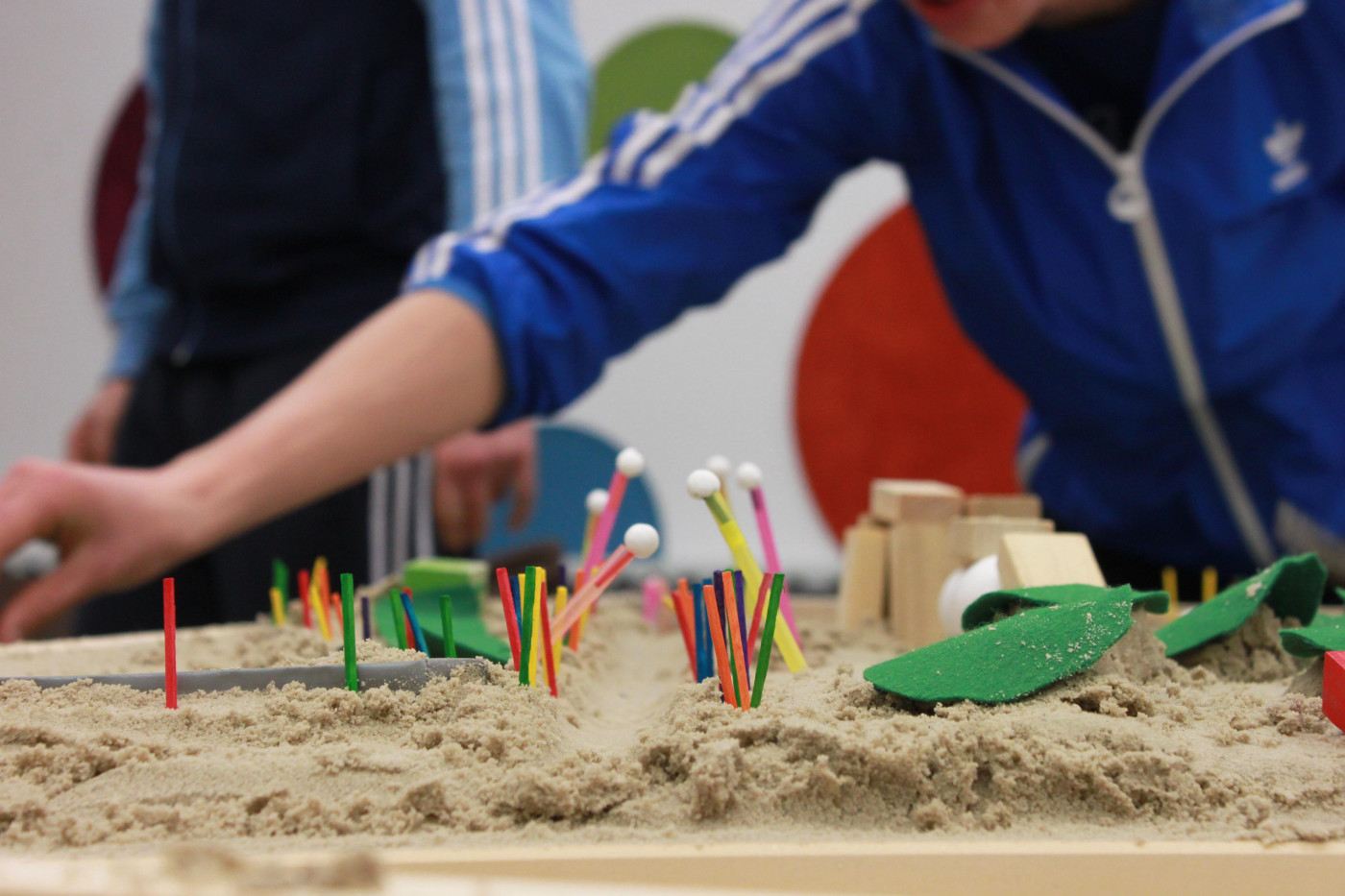
In April of 2012, a large-scale renovation project was conducted to revitalize Poppintree Park in the town of Ballymun, Ireland.  The conceptual development (by Mitchell + Associates, Landscape Architects) went much further than public consultations and community outreach.  It actively sought to engage the community directly in the process of design.3  Architect David Andrews conducted design + build workshops with local youths who were not only asked their option, but were given an opportunity to demonstrate their expertise as the eventual park users in a hands-on manner.  Infused with local value and functional familiarity, the park went on to receive the 2012 LAMA Community and Council Award for Best Public Park4 – an indication that the park’s underlying design considerations resonated with the greater community.

IMPLICATIONS OF PARTICIPATORY DESIGN

Rehearsing a design with eventual users can generate intuitive environments that address unique, localized needs but that are capable of adapting to changing demands.  For instance, design parameters that are primarily directed by efficiency rather than use will likely result in environments that are populated entirely with automated systems, essentially depriving occupants of a tactile grasp of the mechanics.  These centralized and hidden controls tend to overlook individual preference and can create a sense of disengagement and apathy.  When we advocate for resilience, a great deal of that strategy must lie in the adaptability of each system or structure we design.  This understanding is a critical component in our capacity to design environments that truly support those who inhabit them.

Just like the communally inclusive approach that brought Poppintree Park so much success, design criteria can continue to be imagined and prototyped throughout a design process that includes the designers and architects as well as the anticipated occupants and stakeholders.  Along the way, new metrics can be established that help to assess performance and further the project’s development.  Each successive consideration of a design’s eventual use and impact will help address a wider variety of needs, avoid unintended consequences, and more fully integrate it into the surrounding context.  The design firm Snøhetta engages public space in a multitude of domains.  They describe their process of transpositioning as one “in which different professionals – from architects to visual artists, philosophers to sociologists – exchange roles in order to explore differing perspectives without the prejudice of convention.”5  Perhaps convention is the sticky issue and one that is getting more difficult to disrupt.

Poppintree Park

Poppintree Park

Architecture is a highly formalized discipline.  Consequently, its design process is unapproachable for most of the people who will benefit from it.  This campaign for a participatory process seeks to reinforce traditional practice by strategically opening the process of design to greater transparency and inclusivity.  Much like a theatrical rehearsal process, the repetitive cycle of performance, observation, reflection and refinement can help define the roles that a building or design may be required to play.  By implementing inclusive, participatory design strategies, we may begin to address the hidden complexities that arise when society’s demand for adaptive and sustainable space grapples with the longevity of the constructed environment.  Ultimately, any success will depend on how we engage with and learn from the people for whom we design.

JAMES CLOTFELTER


BIBLIOGRAPHY

1 Turner, Cathy and Frankel, Mark, “Energy Performance of LEED® for New Construction Buildings.” New Buildings Institute, Vancouver, March 4, 2008.

2 Manzini, Ezio and Tassinari, Virginia, “Sustainable qualities: powerful drivers of social change,” 2012: 6.

3 “Poppintree Youth Project – Participatory Design,” commondesigns, April 26, 2012, http://commondesigns.wordpress.com/2012/04/26/community-design-of-welcome-sign-to-ballymun/.

4 “Poppintree Park Wins 2012 LAMA Award for Best Public Park,” commondesigns, May 10, 2012, http://commondesigns.wordpress.com/2012/05/10/poppintree-park-wins-2012-lama-award-for-best-public-park/.

5 “Process,” Snohetta, accessed November 4, 2014, http://snohetta.com/process#.


PLATES

1 (Feature) http://commondesigns.wordpress.com/2012/04/26/community-design-of-welcome-sign-to-ballymun/

2 http://designtrust.org/news/making-midtown-workshop-1/photos/632/

3-4 (see 1)

5 http://snohetta.com/assets/process/transpositioning/transposotioning.jpg

Nothing to Be Done

“Architects have no authorship over their product.”

So spake Eva Franch i Gilabert, the fecund ideator at the helm of Storefront for Architecture, at a recent speaking engagement at Parsons’ School of Constructed Environments. Gilabert spoke in the context of her reflections on this year’s Biennale Architetturaits 14th installment — and her statement, while seemingly contentious, is upon closer inspection emblematic of a far broader current of unrest among architecture and its constituents. 

This year’s exhibit was curated by Rem Koolhaas, known worldwide as both a prolific builder and as the influential nexus of many of today’s most prominent figures in architecture. Koolhaas, titling his exhibition Fundamentals, endeavored to “reconstruct how architecture finds itself in its current situation, and speculate on its future,”1 evoking the uncertainty of a discipline with a newfound self-awareness. Seeing, perhaps for the first time, a reflection it not longer recognizes.

Interpretations of Koolhaas’ message vary in flavor and pungency, yet the brunt of criticism lands not, as it may seem, on the shoulders of the curator, but on his subject; architecture is on trial. The question of architecture — an inquiry into what is rather than how does, or when, or why or in order to… — is long in the tooth, yet with each passing generation, receiving a fresh coat of paint, feels fresh. It is not narcissistic, but reflexively existential.

In Koolhaas’ own words,

“Fundamentals consists of three interlocking exhibitions—Absorbing Modernity 1914-2014, Elements of Architecture, and Monditalia—that together illuminate the past, present and future of our discipline. After several architecture Biennales dedicated to the celebration of the contemporary, Fundamentals will look at histories, attempt to reconstruct how architecture finds itself in its current situation, and speculate on its future.” 2


Architecture’s current situation is fraudulent. As so eloquently encapsulated by Samuel Medina, of Metropolis,

“…architecture has become more marginalized than at any point in its history, and architects far less influential in the shaping of the built environment than they’re ready to admit…it is the global neoliberal hegemony to which architects are necessarily beholden that has bankrupted architecture’s creative and critical faculties.” 3

Fundamentals seeks to reveal the mechanisms of architecture as well as its components. but there are many intangible components not displayed – cultural, emotional – suggesting that the biennale instead investigates the components of building systems, the nuances in whose details begins to reveal an underexposed portrait of architecture.

The problem with architecture, and with Fundamentals’ examinations, is that it is so often associated with buildings. Buildings are born out of wedlock and raised at arms length from the parents that bore them.

Fundamentals is not the end of architecture. The components of Elements are not nouns of the language of architecture.4 The details elucidated in Modernity are not its grammar. Architecture cannot be found in the vernacular. It cannot be found within walls or behind doors. Fundamentals searches for architecture in buildings, and finds none. If the answer cannot be found in these, perhaps the wrong questions are being asked.

BRANDON PIETRAS


BIBLIOGRAPHY

1 “Latest Details Released on Koolhaas’ Venice Biennale 2014 ‘Fundamentals’,” ArchDaily, March 12, 2014, http://www.archdaily.com/484728/latest-details-released-on-koolhaas-venice-biennale-2014-fundamentals/.
2″What’s So Different About Koolhaas’ Venice Biennale?,” Metropolis, March 27, 2014, http://www.metropolismag.com/Point-of-View/March-2014/Whats-So-New-about-Koolhaass-Biennale/.
3″Biennale Breakdown: A Guide to the National Pavilions,” Metropolis, June 23, 2014, http://www.metropolismag.com/Point-of-View/June-2014/Venice-Architecture-Biennale-All-the-Highlights-Misses-and-Surprises/?cparticle=3&siarticle=2
4 “Rem Koolhaas is stating the ‘end’ of his career, says Peter Eisenman,” Dezeen, June 9, 2014, http://www.dezeen.com/2014/06/09/rem-koolhaas-at-the-end-of-career-says-peter-eisenman/.


PLATES

1 World Architecture (Edited from original)
The Japan Times